
Understanding Color Temperature and CRI
- By deepak mishra
- Aug 30, 2023

Understanding Color Temperature and CRI

Color temperature refers to the color appearance of light emitted by a light source. It is measured in Kelvin (K) and plays a vital role in determining the atmosphere and ambiance of a space. Imagine the warm, cozy feeling of a sunset or the crisp, cool light of a cloudy day. These distinct sensations are a result of different color temperatures.
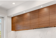
Light sources with lower color temperatures (around 2000K to 3000K) emit warm, reddish hues. These are often associated with relaxation and intimacy, making them a popular choice for residential spaces and hospitality environments. On the other hand, higher color temperatures (5000K and above) produce cooler, bluish tones, akin to daylight. These cooler tones are often used in workplaces and retail settings for their ability to boost alertness and focus.
Architects and designers skillfully wield color temperature to create specific atmospheres. A restaurant may opt for warm lighting to encourage diners to linger, while a contemporary art gallery might employ cooler lighting to enhance the visibility of intricate details.
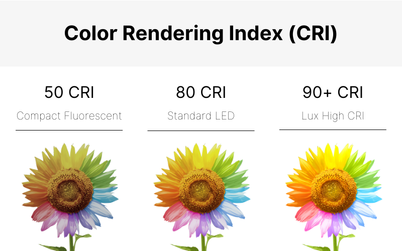
Color Rendering Index (CRI) is a metric that gauges how accurately a light source reveals the true colors of objects compared to natural sunlight. It is measured on a scale of 0 to 100, with higher values indicating better color rendering. A CRI value of 100 signifies that the light source replicates colors with exceptional fidelity.
For architects and designers, CRI is a crucial consideration, especially in spaces where color accuracy is paramount, such as retail stores, museums, and studios. A high CRI ensures that the nuances of color are faithfully represented, allowing customers to perceive products as they would under natural lighting conditions.
In healthcare environments, accurate color rendering is essential for medical examinations and procedures. Imagine a medical professional misinterpreting the hue of a patient's skin due to poor lighting—such situations underscore the significance of CRI in critical settings.
In the world of lighting design, color temperature and CRI often work in tandem to achieve the desired effects. A well-designed lighting scheme strikes a balance between these two factors to create spaces that are both visually appealing and functional.
For instance, a high-end fashion boutique might blend warm lighting with a high CRI to ensure the clothing's colors appear rich and true, while also providing an inviting atmosphere. Similarly, in a modern office, a cooler color temperature combined with a decent CRI can help foster productivity and concentration among employees.
When selecting lighting fixtures for your living space, consider the mood you want to create. Would you prefer a cozy, relaxed ambiance or a vibrant, energetic one? Similarly, being aware of CRI can guide your choices to ensure that your environment accurately reflects colors, whether you're applying makeup, arranging furniture, or simply enjoying art.
In conclusion, color temperature and CRI are two fundamental aspects that shape our interaction with the spaces we inhabit. Architects and designers use these tools to craft immersive experiences, while the general public can benefit from this knowledge to curate their personal environments. By understanding the interplay between color temperature and CRI, we can illuminate not only our physical surroundings but also our emotional and sensory experiences.
Understanding Color Temperature and CRI

Light is an essential element that shapes our perception of the world around us. Whether in architectural design, interior decoration, or simply our daily lives, understanding the concepts of color temperature and Color Rendering Index (CRI) can significantly impact the way we experience and interact with our environment.
Color Temperature: Setting the Mood
Color temperature refers to the color appearance of light emitted by a light source. It is measured in Kelvin (K) and plays a vital role in determining the atmosphere and ambiance of a space. Imagine the warm, cozy feeling of a sunset or the crisp, cool light of a cloudy day. These distinct sensations are a result of different color temperatures.
Light sources with lower color temperatures (around 2000K to 3000K) emit warm, reddish hues. These are often associated with relaxation and intimacy, making them a popular choice for residential spaces and hospitality environments. On the other hand, higher color temperatures (5000K and above) produce cooler, bluish tones, akin to daylight. These cooler tones are often used in workplaces and retail settings for their ability to boost alertness and focus.
Architects and designers skillfully wield color temperature to create specific atmospheres. A restaurant may opt for warm lighting to encourage diners to linger, while a contemporary art gallery might employ cooler lighting to enhance the visibility of intricate details.
Color Rendering Index (CRI): Unveiling True Colors
Color Rendering Index (CRI) is a metric that gauges how accurately a light source reveals the true colors of objects compared to natural sunlight. It is measured on a scale of 0 to 100, with higher values indicating better color rendering. A CRI value of 100 signifies that the light source replicates colors with exceptional fidelity.
For architects and designers, CRI is a crucial consideration, especially in spaces where color accuracy is paramount, such as retail stores, museums, and studios. A high CRI ensures that the nuances of color are faithfully represented, allowing customers to perceive products as they would under natural lighting conditions.
In healthcare environments, accurate color rendering is essential for medical examinations and procedures. Imagine a medical professional misinterpreting the hue of a patient's skin due to poor lighting—such situations underscore the significance of CRI in critical settings.

Balancing the Duo for Optimal Lighting Design
In the world of lighting design, color temperature and CRI often work in tandem to achieve the desired effects. A well-designed lighting scheme strikes a balance between these two factors to create spaces that are both visually appealing and functional.
For instance, a high-end fashion boutique might blend warm lighting with a high CRI to ensure the clothing's colors appear rich and true, while also providing an inviting atmosphere. Similarly, in a modern office, a cooler color temperature combined with a decent CRI can help foster productivity and concentration among employees.
Democratizing the Knowledge
When selecting lighting fixtures for your living space, consider the mood you want to create. Would you prefer a cozy, relaxed ambiance or a vibrant, energetic one? Similarly, being aware of CRI can guide your choices to ensure that your environment accurately reflects colors, whether you're applying makeup, arranging furniture, or simply enjoying art.
In conclusion, color temperature and CRI are two fundamental aspects that shape our interaction with the spaces we inhabit. Architects and designers use these tools to craft immersive experiences, while the general public can benefit from this knowledge to curate their personal environments. By understanding the interplay between color temperature and CRI, we can illuminate not only our physical surroundings but also our emotional and sensory experiences.


